Do you know what Minnesota’s state flag looks like? Don’t be embarrassed if you don’t; relative few people do. And that’s because it’s fairly undistinguished, “generic” even. And that’s why the proposed new flag design, unfurled before a state House committee last week, deserves serious consideration.
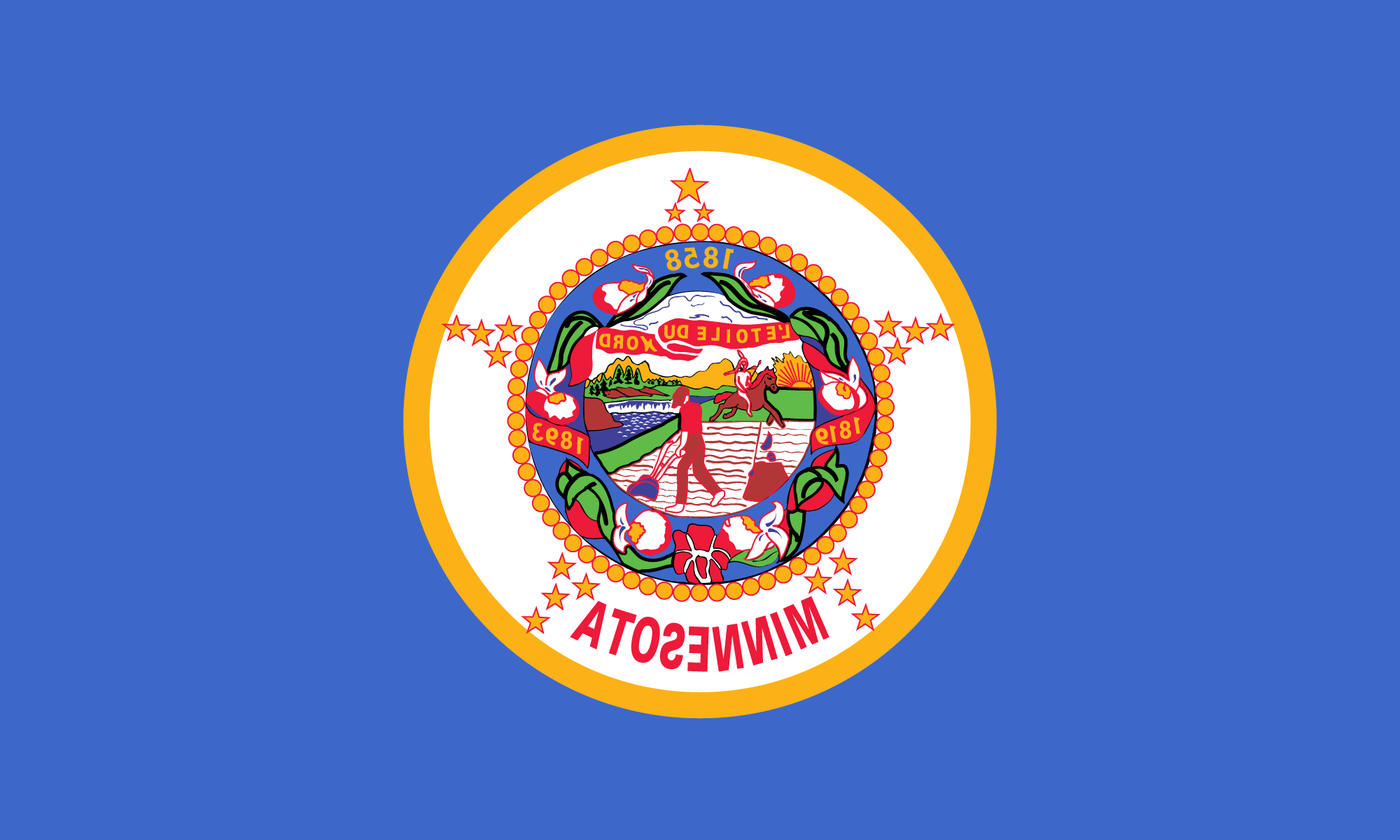
Minnesota’s banner has waved in anonymity since 1893, when it was designed — white on one side and blue on the other, with the state seal in the middle of both sides. In the late 1950’s, it was changed to blue on both sides.
 There are a couple of problems with that design. First off, it is virtually identical to 20 other states’ flags — 25 if you count the states that use another color instead of blue. Second, everything on the reverse side of the flag is backwards. It declares us to be “atosenniM” and everything looks like it’s written in those funny letters the Russians use. Finally, it says nothing about us as a people or about Minnesota as a state. The art on the state seal depicts an Indian fleeing from an armed farmer while apparently showing him an obscene gesture. In the background is a sun setting behind some mountains.

The new design, proposed by a group of people from Rochester, is unique and colorful, and its symbolism celebrates the good things of Minnesota. The basic design involves three horizontal stripes, the top one equal in width to the bottom two. The top two-thirds is blue, for the Land of Sky-Blue Waters (Mini Sotor in Ojibway). The green bottom stripe represents the great northern forests and sprawling southern prairies, the state’s great vegetable heritage. The white of the center stripe is for the winters we all endure and survive together. Completing the design is a gold “North Star” in the upper left-hand corner on the blue section.
Other states have striking and unique flags. Alaska’s is a tasteful blue with eight stars arranged as the Big Dipper and Pole Star; New Mexico has yellow with an Indian sun symbol. Wyoming has a white buffalo on blue; Indiana has blue with a gold torch. Hawaii’s is an eye-popper that looks like a collision between the U.S. and British flags. And there are many more marvelous designs.
The whole point of a flag is to be a symbol, and Minnesota’s current flag doesn’t do the job. We need a flag with some flash and some color. We need a flag that’s as unique as Minnesota and Minnesotans.