Why do we need a new Minnesota state flag?
- You can’t see its details from afar: everything becomes invisible because the state seal is too detailed. From only a few yards away, the details on the Minnesota flag disappear. Only from close range are any details visible.

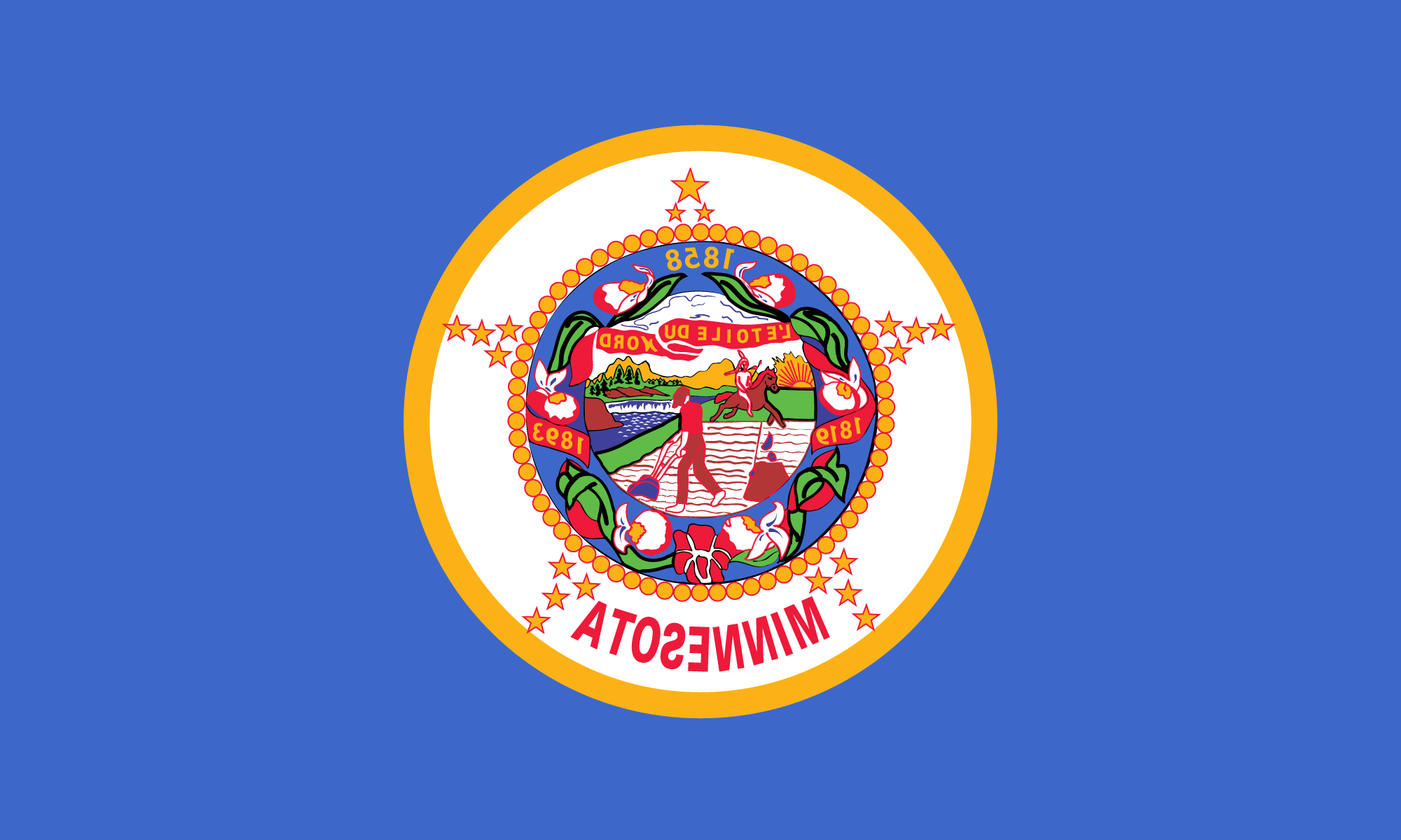
The current state flag, as often flown. Can you tell it’s flipped and inverted? Most can’t… - Few can remember its details: they’re too complicated to be recalled or sketched.

Can you sketch it from memory? - It is confused with more than twenty other state flags: all blue backgrounds with a seal.

Can you tell which is Minnesota’s? - Everything is backwards on the flag’s reverse: pictures, dates, & slogans (“atosenniM”).

Old state flag, as viewed if the wind blows right to left, which it sometime does… - The design is not versatile: the flag can’t be reproduced well on miniature items and appears crooked when hung vertically.
- It uses tiny pictures and dates: it lacks bold color patterns and symbols, like those found in many good flag designs.
- It repeats itself: the north-star appears twice (the motto and topmost star); statehood twice (“1858” and 19 stars); and the flag is even stamped with the name “Minnesota” (which shouldn’t be necessary if other design elements convey the idea of Minnesota).
- Its symbols are controversial: the seal originally symbolized the white man’s takeover of the frontier from the Native Americans.
- A seal is meant for documents, not flags: the seal’s crowded details can only be seen up-close, because it was designed like a portrait.
- It is not widely admired: the mark of a good flag is that it is recognizable due to widespread use, which the Minnesota flag is not.
What does good design look like?
There are five principles of good flag design*:
- Keep It Simple. The flag should be so simple that a child can draw it from memory…
- Use Meaningful Symbolism. The flag’s images, colors, or patterns should relate to what it symbolizes…
- Use 2 or 3 Basic Colors. Limit the number of colors on the flag to three which contrast well and come from the standard color set…
- No Lettering or Seals. Never use writing on any kind or an organization’s seal…
- Be Distinctive or Be Related. Avoid duplicating other flags, but use similarities to show connections…
*Ted Kaye, North American Vexillological Association (NAVA), “Good Flag, Bad Flag”