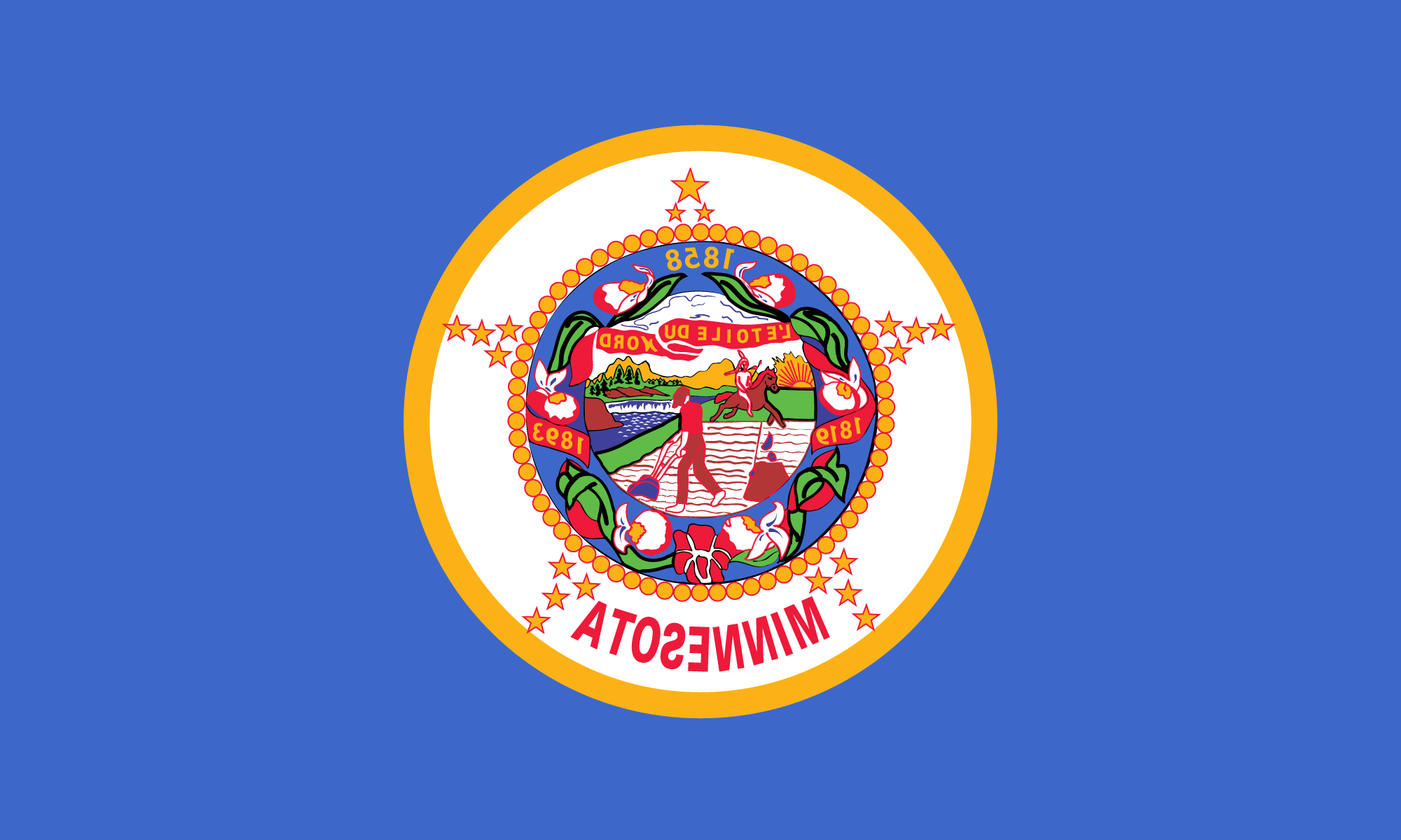
The proposed design I came up with starts with the current state flag and would remove the state seal and surrounding decorations, dates, ribbon, state flower and the name of the state. The most distinct feature of the current flag, the white disk that is a left over from the original flag would remain. The stars forming a larger star would be increased from 19 to 32, Minnesota was the 32nd state to join the Union, and the arrangement changed to form a circle around the white disk. In place of the seal in the middle I would put a gold and blue compass that extends over the edges of the white disk. The circle of stars would become points of the compass with the North Star being slightly larger then the rest representing Minnesota, the North Star State.
 On the background would be placed a green stripe in the bottom 3rd of the flag. The stripe would represent a simplified rendition of a tree lined lakeshore with the blue sky reflected in the lake below. The name of the state comes from “minisota”, a Native American name which means “sky-tinted water.” This scene is depicted in both the state license plate (figure d) and in the new Minnesota state quarter design (figure e). Minnesota is also known as the land of 10,000 lakes.
The last feature of my new design would be the swallowtail cut along the fly of the flag. Ohio is the only other state flag that is not rectangular. In the case of Minnesota the design feature would resemble the distinct shape of the Eastern border of the state. No other state in the country could do this, unless you consider Colorado or Wyoming. The shape of the state is another commonly used symbol of the state as seen in the license plate and the state quarter or the Welcome to Minnesota signs.

