Two high school students convince Rep. Peter Fischer to redesign Minnesota’s State Flag.
Star Tribune | City flags are having a moment – everywhere but Minneapolis
By Richard Chin | Star Tribune
O, say can you see … the Minneapolis city flag?
Odds are, you didn’t know Minneapolis has a flag, much less seen it gallantly streaming.
Although Minnesota’s biggest city has had a city flag for more than 60 years, residents haven’t exactly rallied around it. It’s rarely seen in public. In the few places it has been displayed, it often has flown upside down or with the colors reversed — without anyone noticing.
People who do know the flag describe it as mediocre at best and “incredibly boring” at worst.
Which is a pity, because a good city flag is a place-making tool, something to demonstrate civic pride, especially when lots of visitors come to town for, say, a Super Bowl.
Everywhere (other than Minneapolis), municipal flags are having a moment.
Just across the river, there’s been a grass-roots movement to make the St. Paul flag more visible. The bright yellow, blue and red banner is flying at ballparks, breweries, bars and homes.
A recent redesign of the Crystal city flag has resulted in what one expert called one of the nation’s best. And a contest is underway in Rochester to come up with a new flag, making it one of about 100 cities nationwide trying to create a city flag worth saluting.
If you wonder why a city should bother with a banner, just ask Chicago.
Regarded as one of the best nationwide, the Chicago flag has been embraced by residents as part of the city’s identity, not just a symbol of the city government. Its four-star flag (adopted in 1917, with stars added in 1933 and 1939 to reflect key events) shows up on uniforms, hats, coffee mugs, Christmas ornaments and bike messenger bags. There’s even a website devoted to Chicago flag tattoos. That’s what you call a good branding.
It’s not that other cities aren’t trying. According to the Flags of the World website, more than 50 cities in Minnesota, from Albertville to Zumbrota, have a municipal flag.
But most city flags are “the worst-designed thing you’ve never noticed,” according to a 2015 TED talk on the subject by Roman Mars, host of “99% Invisible,” a radio show about design and architecture.
The principles of good flag design call for simple design with meaningful symbolism and no more than two or three basic colors, say flag experts, or vexillonnaires.
But municipal flags often are what flag fans call an SOB (seal on a bedsheet), or they have words written on them — both of which are hard to distinguish on a flapping piece of cloth 25 feet in the air.
Most of the city flags in Minnesota feature lettering, typically the name of the city, often tossing in an anodyne motto: “Serving Today, Shaping Tomorrow” (Maple Grove), “A Proud Past – A Promising Future” (Farmington).
But “if you need to write the name of what you’re representing on your flag, your symbolism has failed,” said Ted Kaye, a member of the North American Vexillological Association.
Minneapolis flag takes flak
Minneapolis’ blue and white flag, with its seal-like symbols — which include a building, a gear, a ship’s wheel and a microscope — barely merited a C grade (5.58 points out of a possible 10) in a 2004 survey conducted by the Vexillological Association rating 150 municipal flags in the U.S.
Despite being largely unseen, it has routinely taken flak.
In a 2012 MinnPost article, writer and artist Andy Sturdevant said the flag is “just not inspiring.” Gizmodo featured the Minneapolis city flag in a 2015 article asking, “Are These the Ugliest City Flags on Earth?” And a 2017 City Pages article dissed the Minneapolis flag for its “hollow symbolism.”
Even its designer admitted that “there are fewer and fewer places where you can see it,” said Louise Sundin.
She is executive vice president for the Minneapolis Regional Labor Federation and a trustee with the Minnesota State Colleges and Universities. But back in 1955, when she was a teenager attending Southwest High School, she won a contest to design a new Minneapolis flag. She received a $250 U.S. savings bond.
“I was really proud,” she said.
While she thinks the symbols on her flag are “still appropriate,” she understands that tastes — and flag designs — have changed. “I can’t imagine that design is flawless forever,” she said.
Some people have suggested alternative designs for a Minneapolis flag. But there hasn’t been a groundswell of support to replace Sundin’s design. The Citizens for a Minneapolis Flag Redesign Facebook page, which had 68 followers, hadn’t had a post for a couple of years and now appears to be offline.
Minneapolis City Council Member Linea Palmisano, who is from Chicago, has seen what a valuable tool the city flag is there. In 2015, she tried to get an initiative going to create a new Minneapolis flag in time for the Super Bowl. But interest, uh, flagged. “It got deprioritized,” she said.
St. Paul flag is ugly but beloved
In the Vexillological Association survey, St. Paul’s flag was rated even lower than Minneapolis’. But that hasn’t stopped St. Paulites from embracing it.
Featuring a shield with images of the Capitol dome, the Rev. Lucien Galtier’s chapel, the North Star and a winged wheel, St. Paul’s flag was designed in 1932 by Gladys Mittle, an art student at the then-College of St. Catherine.
As recently as 2004, there were only four known copies of the St. Paul flag on public display, according to a Pioneer Press report.
At the time, St. Paul Mayor Randy Kelly suggested a contest to replace the Mittle flag with something “more dynamic.” But Kelly’s idea didn’t fly. In 2012, Sturdevant wrote that he couldn’t find any public displays of the St. Paul flag.
But oddly, since then, the old flag has begun to experience a renaissance.
“You see it and you think, ‘Wow. What’s that?’ ” said St. Paul resident Andrew Korsberg. “I thought the flag was good looking. I wanted to fly the flag at home.”
He and a group of friends ordered city flags. In 2014, he flew the flag at his Hamline-Midway home. Then one of Korsberg’s friends, St. Paul geographer Bill Lindeke, started selling the flag on his blog site(tcsidewalks.blogspot.com).
In the past two or three years, Lindeke has sold 200 to 300 flags to residents and businesses. They’ve been flown at CHS Field, Minnesota United games, Can Can Wonderland and a pickle vendor’s stall at the farmers market.
Sustain Ward 3, a St. Paul neighborhood group, has used the flag to rally its members in their advocacy for sustainable city planning and more affordable housing.
“It might be a bit of a silly design, but it’s ours,” said group chairman Brandon Long. “It is our flag, and we really love our city.
The Good: Chicago’s flag is an example of what a city flag should look like. It’s simple, yet gives a nod to four pivotal events from the city’s past. The popular design is used on everything from uniforms and hats to coffee cups.
The Bad: St. Paul’s flag is considered even worse than Minneapolis’, still St. Paulites are starting to embrace the 1932 design. It’s being flown at sports games, restaurants/bars and private homes.
And the Ugly: Efforts to replace the rarely seen and much maligned Minneapolis flag have, uh, flagged. So the 1955 pendant-style flag — with its indecipherable symbols — remains the city’s official flag.
City Pages | Petition seeks to change Minnesota’s ‘shameful’ state flag, offers 9 alternatives
by Jay Boller in News
By most accounts, Minnesota is not a garbage state. Just look at our sterling performance on various lists. But by at least 103 accounts, we’ve got a garbage state flag.
So claims a petition launched Tuesday by St. Paul resident Guy Johnson. Having already attracted 103 e-signatures, the campaign implores Gov. Mark Dayton to change our “shameful” state flag, one that’s beset by “unoriginality [sic] and laziness.” Johnson clearly loves Minnesota, and he thinks the North State State deserves better. Here’s his plea:
“Let’s start off with the obvious. Our flag is hardly a flag, a seal is not a flag. As a state with its own culture, we need a flag that can represent that. The state of Minnesota is unparalleled in every aspect but one. Minnesota’s distinctive culture, varied landscapes, and diversity of people all make it stand out amongst the midwest. But our flag falls flat. Its unoriginality and laziness are shameful. We need a flag that lives up to the grandeur of our state, a flag that the people of Minnesota can be proud of. That is why we are proposing a flag referendum.”
Count Brian Glynn of Bemidji among the supporters.
“Our flag sucks,” he contends in the comment section.
The petition isn’t all shit-talking, though. In it, Johnson links to a Reddit community that already got cracking on designing Minnesota a new flag.
Our take? The old flag’s OK!
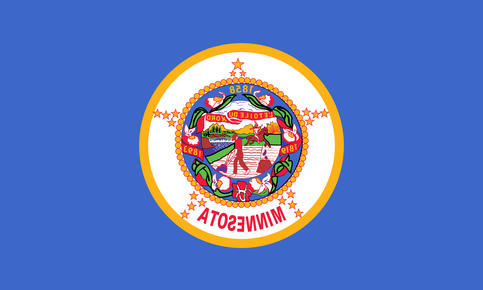
It features a banner that reads “L’Étoile du Nord,” which the internet tells us is French for “Star of the North.” Nice. We got a lil plow guy, a metaphor for how Minnesotans love toiling in the dirt. The naked cartoon Native American, not to mention the skeptical stare he’s getting from lil plow guy, is a bit problematic. The wreath of lady’s slippers — our state flower, mind you — is a pleasant touch. The years represent statehood (1858), the opening of deeply problematic Forth Snelling (1819), and adoption of the original flag (1893), perhaps the most boring date you’ll ever encounter. Aesthetically, the flag manages to be both busy and bland.
Hmm … On second thought, maybe we do have a garbage flag, one not befitting our non-garbage state. In fact, Minnesota’s flag was named among the 10 worst state/provincial flags in a 2001 survey by the North American Vexillological Association. Advocacy (flagvocacy?) group Minnesota Flag Coalition seems to agree.
Brian Glynn of Bemidji was right all along!
Saint Cloud Times | Here’s a proposal for a new Minnesota state flag design
There’s not much to celebrate in Minnesota on Flag Day.
The Minnesota flag is ranked as one of the 10 worst state flags by the North American Vexillological Association. This group, which is dedicated to the academic study of flags, gives particularly low ratings to flags like ours that look like a “state seal on a bedsheet.”
From a botanical perspective, the Minnesota state flag is definitely a loser.
A tree stump and a farmer tilling a virgin prairie are prominently featured. There must be a better way to represent the importance of forestry and agriculture, without emphasizing the destruction wrought by these industries.
On the positive side, the Minnesota state flag also includes a wreath of showy lady’s slipper orchids, our state flower. Coincidentally, they bloom about Flag Day, June 14.
There have been various proposals for a new Minnesota flag. It’s time that we adopt a more appropriate, and preferably plant-themed, design.
There are lots of beautiful flags with a botanical motif that we can use as a model. The Canadian flag with its maple leaf and the South Carolina state flag featuring a palmetto are my favorites.
Although we wouldn’t go wrong by elevating the showy lady’s slipper to a central position on the flag, my design for a new Minnesota flag would feature trembling aspen.

This tree, which is also called quaking aspen or popple, is the perfect choice to adorn any flag. That’s because its leaves behave more like a flag than any other plant — the leaves flutter, or quake, in the wind.
The reason this occurs is because the leaf stalk is not round as it is in most plants. Rather, it is flattened in a direction parallel to the main stem. As a result, even the slightest breeze causes the leaves to wobble side-to-side, flag-like, along their central axis.
Second, trembling aspen is the most abundant tree in Minnesota. With the exception of a few counties in the southwest corner of the state, it grows throughout the state. From this perspective, it symbolically unites the diversity of people and habitats throughout the state.
Finally, trembling aspen has the tendency to send up sucker shoots from the root system. A single tree can quickly colonize a large area. This ability is reminiscent of the settlers who arrived in the 1800s and rapidly spread throughout Minnesota.
Clearcutting and burning the debris, which are traditional forest harvesting practices, stimulate the formation of aspen sucker shoots. Consequently, as Welby Smith notes in his outstanding book “Trees and Shrubs of Minnesota,” “the vast expanses of trembling aspen seen in northern Minnesota today are the legacy of pine logging a century ago.”
Let’s put trembling aspen on our Minnesota state flag. It would be a much more appropriate symbol to represent the history and importance of forestry in the state than a pine stump. Now, that would be something to celebrate.
This is the opinion of Stephen G. Saupe, a professor in the biology department of the College of St. Benedict and St. John’s University and director of the CSB/SJU Bailey Herbarium and Melancon Greenhouse. He can be reached at newsroom@stcloudtimes.com.
MPR News | Is it time to ditch the Minnesota flag?
By Bob Collins
I was wondering whether a long simmering controversy would reignite in the wake of the focus on the Confederate flag.
Today.
What’s the deal with this flag, Minnesota?
First of all, they jammed about 10,000 things onto it. You’ve got your farmer, your sunrise, your waterfall, the state flower and, oh yes, your near naked Native American riding by on a horse.
“The image of the pioneer, a peaceful man who has laid down his gun and is plowing his field, is juxtaposed with the image of the Indian, who may still want to fight (his spear is at the ready) but who seems to be riding away,” writes Judith Harrington in today’s Star Tribune. She’s an assistant professor at the University of Wisconsin-La Crosse.
“The pioneer/farmer is using a plow, a symbol of civilization. The white man is depicted as a ‘doer’ who is entitled to the land, trees and water, empowered by the concept of Manifest Destiny. The Indian is the vacating tenant. A peaceful transition is suggested, but this ignores the tense and problematic history of conflict between European settlers and Indians, such as the complicated history of treaties and the Dakota War of 1862.”
“It does not reflect the values and sensibilities of Minnesotans today,” she writes.
The flag has been occasionally debated almost since Gov. Sibley saw the painting and thought it’d be a great symbol of a pretty good state.
It’s not the only state flag getting a little criticism this week. In Massachusetts the governor has hinted he’d be open to a new design after the Confederate flag protests prompted a little introspection.
“By the sword we seek peace, but peace only under liberty,” the state motto on the flag says.
“The irony of using a Native American on the arms of the political entity that destroyed them is rather like a hunter hanging trophy heads on his wall,” a respondent in a poll said.
“It is hard to read it all together as anything but a flag designed by and for the colonial conquerors who made the Bay State, the ones who won the land — with a short time out for Thanksgiving dinner — by all but eradicating the people who got here first,” writes Boston Globe columnist Yvonne Abraham.
In both cases, our state flags represent the way we frame history — war and conquest.
Would we even know how to begin thinking about our history any other way?
Star Tribune | As long as we’re discussing flags, what about Minnesota’s?
It, too, may fail to reflect current sensibilities.
The current interest in the removal of the Confederate battle flag from public displays and store shelves provides an excellent opportunity to examine what the Minnesota state flag represents. The images on the flag are interpreted by state documents as innocuous symbols of the state’s history. A critical examination of what the flag is saying, however, should make Minnesotans reconsider what their state flag projects about their state.
The state flag of Minnesota is often something that is taken for granted. Thousands of people see the flag flying without giving it a second thought. First unfurled in 1893 (a date found on the flag), it has the state seal featured prominently in its center. The seal was based on a painting by Seth Eastman and was promoted by Gov. Henry Sibley; it did engender criticism when first used in 1858, but was not changed.

The “great symbolism” of the figures on the seal, as described by the Office of the Minnesota Secretary of State, include an American “Indian on horseback … riding due south and [representing] the Indian heritage of Minnesota. The Indian’s horse and spear and pioneer’s ax, rifle, and plow represent tools that were used for hunting and labor” (Minnesota Legislative Manual).
A close examination shows the central figure to be a white pioneer dressed in work clothes, wearing a wide-brim hat and pushing a plow. He is an iconic image of a hardworking, rugged individualist who works alone to chop the trees, plow the land and protect his home. He is looking over his shoulder at the Indian, who is riding a horse and holding a spear.
The contrast in the images of the figures is interesting: The image of the pioneer, a peaceful man who has laid down his gun and is plowing his field, is juxtaposed with the image of the Indian, who may still want to fight (his spear is at the ready) but who seems to be riding away. The pioneer/farmer is using a plow, a symbol of civilization. The white man is depicted as a “doer” who is entitled to the land, trees and water, empowered by the concept of Manifest Destiny. The Indian is the vacating tenant. A peaceful transition is suggested, but this ignores the tense and problematic history of conflict between European settlers and Indians, such as the complicated history of treaties and the Dakota War of 1862. More problematic, however, is the depiction of a racist, stereotyped Indian, who wears only a loin cloth and a feather.
The Minnesota state flag has engendered criticism — particularly in the past 50 years, as outlined on William Becker’s and Lee Herold’s website (see http://mnflag.tripod.com): In the civil-rights era of the 1960s, the rider on the horse was changed to a white rider for the state seal, but this was not used for the flag. The Minnesota Board of Human Rights pushed for changing the seal in 1968, but this did not go far; the two major newspapers in the state gave the proposal little regard (the St. Paul Pioneer Press decried the cost of any such change, while the Minneapolis Star said the Minnesota Board of Human Rights was “on the warpath” about the seal). An entirely new flag was proposed in 1989 by Becker and Herold, with a star and a simple white, blue and green wave design, but it has not gained sufficient support.
The history of Minnesota includes many different stories, and the state flag should represent those many voices or — at the very least — not be offensive to those who live there. There have been voices of protests for this flag ever since the seal was first used. It is time that the state flag is revised, perhaps through a statewide design contest. While the current flag may represent a certain view and vision of the past, it does not reflect the values and sensibilities of Minnesotans today.
Judith Harrington, of New Richmond, Wis., is an assistant professor at the University of Wisconsin-La Crosse.
Rochester Post-Bulletin | Time for New State Flag
A good case can be made for designing a new state flag for Minnesota. The main reason is that the existing state flag, adopted in 1893, is poorly designed, according to flag design experts. It lacks focus, is too complex and uses symbols that are not relevant to 21st century Minnesotans. The flag consists of a rectangular blue field with the state seal at the center. In the center of the state seal is a Minnesota pioneer plowing the prairie, with an American Indian horseman riding in the background. The flag bears three dates — 1858, when Minnesota was admitted to the union; 1819, when Fort Snelling was established; and 1893, the year the flag was adopted. In addition, there are 19 stars, since Minnesota was the 19th state admitted to the Union after the first 13.
There are more details, but those are enough to show that the flag violates the first requirement of a flag design — simplicity. Fortunately, a Rochester man, Lee Herold, has been active in offering a replacement design to a legislative committee. The committee is headed by state Sen. Ed Oliver of Deephaven, Minn. Oliver supports a bill that would appoint a task force to select a new state flag. Herold, who operates Herold Flags in Rochester, has advised the committee that the Minnesota flag design has been ranked 67th out of 72 state and provincial flags evaluated by the North American Vexillogical Association, and organization of flag design experts. It based the ranking on a poll of 400 flag experts throughout the world.

Herold says that there are a few key standards for good flag design. They include simplicity, good use of color, distinctiveness, differentiation from other flags and “flyability” — how the flag looks when flying or at rest. The design should be easy to remember and should have a distinct focus. All of those characteristics are present in a design presented to the committee by Herold. It includes a large yellow star on a field of blue, with a white stripe underneath. Herold said that he hopes the task force is appointed and that it reviews the subject and chooses a new flag — whether it is the design that he suggested or another one.
Choosing a new state flag is probably not at the top of the list of urgent needs for most Minnesotans. However, a state flag serves the same purpose as the nation’s flag — a symbol of unity and common purpose. As long as Minnesota has a state flag, it might as well have one that is recognizable and well-designed, not one that is archaic, cluttered, and mostly forgotten. We wish Lee Herold good luck in his effort to have a task force appointed to review the need for a new design.
Pioneer Press | Flag of a Different Color
It seems many Minnesotans agree with flag scholars who recently declared our state’s flag one of the nation’s ugliest. In response to that troubling national report, the Pioneer Press asked readers to submit their designs for a new, improved flag …. We thank all who submitted designs. Here are the winners — one best overall, plus winners in each of three age groups.
Best Overall: The Rev. William Becker of Austin, Minn., and Lee Herold of Rochester, Minn. Herold and Becker believe Minnesota needs a vibrant flag that speaks to Minnesotans as powerfully as the U.S. flag speaks to all Americans (Becker, of Queen of Angels Church in Austin, is an expert on the state flag with the Minnesota Historical Society).
In 1989, Becker and Herold appeared before the Minnesota Legislature twice to discuss creating a new flag. This flag, what they call “the North Star banner,” was the design they presented. But it was not adopted by the state.
Now, the men hope their ode to Minnesota will receive renewed attention. They say their flag has multiple meanings: the North Star recalls the state motto, adopted by the pioneers; gold is for our state’s natural wealth; blue is for our lakes and rivers; the waves illustrate the Indian name “minisota” (meaning sky-tinted water) and the “land of 10,000 lakes”; white is for our winter; green is for our farmland and forests.
StarTribune | Speaking of State Flags…
The Star Tribune recently voiced Minnesotan’s objections to official display of the Confederate flag at South Carolina’s statehouse. Minnesotans, however, should look first at our own state flag. After all, its history is also marred by bigotry.

Among other things, Minnesota’s flag features our state seal. The latter shows a pioneer farming and an Indian riding away on horseback. It was created for the Minnesota territory in 1849. It symbolized Indian flight from the white man’s “manifest destiny” – a nineteenth century euphemism for what amounted to ethnic cleansing.
Even then the Minnesota historical Society acknowledges the symbolism. The following poem about the seal was written by the wife of its designer:
“Give way, give way, young warrior,
Thou and thy steed give way;
Rest not, though lingers on the hills
The red sun’s parting ray.
The rock bluff and prairie land
The white man claims them now,
The symbols of his course are here,
The rifle, axe, and plough.”
 Civil rights advocates objected to the seal for decades before the Legislature modified it in 1983. The Indian no longer flees westward into the setting sun. He rides south instead. Nevertheless, for many Minnesotans the seal’s original legacy is hard to forget.
Eleven years ago the Star Tribune endorsed the idea of a new Minnesota flag. After all, few Minnesotans recognize or remember it’s complicated design (editorial, March 21, 1989) surely woeful history is another reason. Why should our state flag summon up bitter memories instead of honor for all?
I agree that the Confederate flag should be hauled down from the South Carolina statehouse. But before Minnesotans moralize further about symbols of the Southern bigotry, let’s examine our own.
– The Rev. William M Becker, Winona State University, Minn., Assistant Professor of Theology
(Originally published in the Minneapolis Star Tribune, February 12, 2000. Reprinted with the author’s permission)
Mankato Free-Press | We Salute the New, Unique Flag Design
Do you know what Minnesota’s state flag looks like? Don’t be embarrassed if you don’t; relative few people do. And that’s because it’s fairly undistinguished, “generic” even. And that’s why the proposed new flag design, unfurled before a state House committee last week, deserves serious consideration.
Minnesota’s banner has waved in anonymity since 1893, when it was designed — white on one side and blue on the other, with the state seal in the middle of both sides. In the late 1950’s, it was changed to blue on both sides.
 There are a couple of problems with that design. First off, it is virtually identical to 20 other states’ flags — 25 if you count the states that use another color instead of blue. Second, everything on the reverse side of the flag is backwards. It declares us to be “atosenniM” and everything looks like it’s written in those funny letters the Russians use. Finally, it says nothing about us as a people or about Minnesota as a state. The art on the state seal depicts an Indian fleeing from an armed farmer while apparently showing him an obscene gesture. In the background is a sun setting behind some mountains.
The new design, proposed by a group of people from Rochester, is unique and colorful, and its symbolism celebrates the good things of Minnesota. The basic design involves three horizontal stripes, the top one equal in width to the bottom two. The top two-thirds is blue, for the Land of Sky-Blue Waters (Mini Sotor in Ojibway). The green bottom stripe represents the great northern forests and sprawling southern prairies, the state’s great vegetable heritage. The white of the center stripe is for the winters we all endure and survive together. Completing the design is a gold “North Star” in the upper left-hand corner on the blue section.
Other states have striking and unique flags. Alaska’s is a tasteful blue with eight stars arranged as the Big Dipper and Pole Star; New Mexico has yellow with an Indian sun symbol. Wyoming has a white buffalo on blue; Indiana has blue with a gold torch. Hawaii’s is an eye-popper that looks like a collision between the U.S. and British flags. And there are many more marvelous designs.
The whole point of a flag is to be a symbol, and Minnesota’s current flag doesn’t do the job. We need a flag with some flash and some color. We need a flag that’s as unique as Minnesota and Minnesotans.