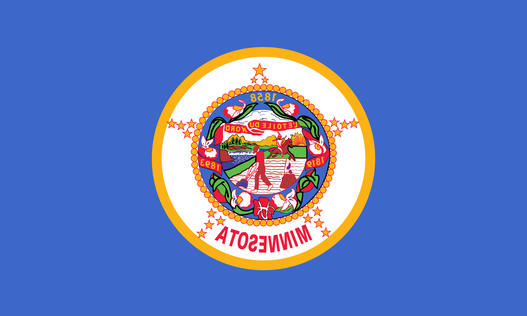
From a distance of 100 yards how many Minnesotans can distinguish their state flag from, say, Nebraska’s? From 100 feet? Anyone want to try for 10 feet?
It’s not that Minnesota has the most prosaic flag of all 50 states. It’s that it shares the distinction with more than a dozen others, each content mainly to sew a copy of its state seal in the middle of a blue sheet and then run the thing up a flagpole to see if anyone salutes, or even notices.

That’s a shame. The official Minnesota flag needn’t compete in splendor with Old Glory. But when displayed with those of other states — as at the recent Inaugural Day Parade or with the Constitution and the Declaration of Independence in the rotunda of Washington’s National Archives building, it ought to stand out enough to catch the eye, and carry enough symbolism to clutch at a loyal Minnesotan’s heart.
Instead, the visitor is more likely to see and admire the dazzling hues of Maryland’s quartered arms, California’s bear flag, Georgia’s Confederate battle flag, Texas’ proud lone star or Iowa’s eagle-emblazoned tricolor. Only the determined eye will pick out Minnesota’s flag from among all the other drab, dark-blue look-alikes.
Minnesota used to be somewhat more imaginative. Until 1957, the flag was blue on one side, white on the other. But flags of such design were expensive. So for the last 32 years, the Minnesota flag has been anonymously blue on both sides.
It’s time for a change. With the approach of the original state flag’s 1993 centennial, a legislative committee has agreed to seek a new design — something more distinctive and recognizable. One committee member dismissed the proposal as a waste of time. But that’s the kind of Philistine thinking that gave Minnesota its present banner. The redesign of the state flag is a good idea that should be treated seriously by legislators, citizens, and flag designers. Minnesotans deserve a state flag they can wave with pride.
