By William M. Becker
January 1, 1992

The history of Minnesota’s state seal has been the object of considerable research over the years. Unfortunately, the same cannot be said of the origins of the state flag. This lacuna is surprising, not only because the flag is an important symbol, but because its obscure origins raise some interesting questions. Why, for example, did Minnesota’s first official flag have a white background? Why was the state seal included in the design? From whence came the idea to picture a wreath of flowers, a spread of stars, a scroll, and three dates?
While a fair amount is known about the political process by which the flag was adopted, the inspiration for its design is, in the current state of research, unclear. We know that in 1891 the Minnesota legislature voted to sponsor an exhibit at the 1893 World’s Columbian Exposition (also known as the Chicago World’s Fair). At this time, Minnesota had an official seal but no flag to display in its worlds fair building. To prepare for the event. Governor William R. Merriam appointed six men to serve as the Board of World’s Fair Managers. By February 1892, “the women of the State interested in World’s Fair work perfected an organization known as the ‘Women’s Auxiliary Board,’ and took charge of the department of women’s work.” For reasons that we do not know, the women’s board formed a six-person state flag committee, chaired by Florence M. Greenleaf of Minneapolis. In February 1893 this group chose a design from a pool of almost two hundred entries. A treasurer’s report shows that Amelia Hyde Center, the wife of a prominent Minneapolis businessman, received fifteen dollars for her prize-winning design, but nowhere in the records is there mention of how it was chosen—and the source of her inspiration remains a mystery. I propose that several regimental colors of Minnesota’s state militia inspired the design.
In addition to cavalry and other units, Minnesota raised eleven infantry regiments (and one independent battalion) for the concurrent Civil and Dakota wars (1861-65) and four for the Spanish-American War (1898) and subsequent Philippine Insurrection. Minnesota troops who fought in the Civil War, like those from other states, carried distinguishing regimental colors. These colors usually followed one of two common patterns. The first was a blue flag that bore the American eagle (in the form of the United States coat of arms) and a group of stars, along with a scroll identifying the regiment; this was the standard pattern issued to all infantry regiments mustered into federal service. Even after federal mustering, however, state regiments also carried more distinctive local patterns instead of the prescribed eagle pattern. According to historian Frederick P. Todd, “Traditionally and by regulation, a United States regiment of infantry had two colors: a national color which was after 1841 the stars and stripes, and a regimental color…which bore the arms of the United States or some other device…The variety of colors…among state regiments was very pronounced. Although the stars and stripes was often carried, the militia corps used state or local, rather than United States devices, as did most of the volunteers.”

For our purposes, these local colors are the more important. In Minnesota, the regimental pattern was a blue flag that bore the state seal in the center along with a scroll identifying the regiment and a ribbon or scroll that carried the state motto, E Etoile du Nord. If employed at all, these flags were generally carried early in the respective conflicts. During the Civil War, the First, Second, Fourth, and Fifth regiments of Minnesota infantry all used colors that followed this seal pattern.
The marked similarity of the state flag, officially adopted by the legislature in 1893, to this group of regimental colors is striking. Both bore the state seal in the very center (although the state flag added a floral wreath around it), and both employed a ribbon or scroll to identify either the regimental name and number or the state motto and three significant dates. In addition, the regimental flags had blue backgrounds, as did the reverse of the state flag. (The original version was made of two pieces of silk sewn together: the blue reverse and a white obverse.)
Thus, it seems likely that the state flag imitated this seal pattern. Scholars’ opinions on the subject, however, are mixed. Whitney Smith, executive director of the Flag Research Center in Winchester, Massachusetts, claims that the influence of the regimental pattern was direct: “[The state] flag followed almost exactly the design of a military color that had been carried by State troops. The principal difference was that in the original standard the designation of the unit was inscribed in gold letters on the reverse, which was blue instead of white, while the State flag omitted this inscription and left the reverse plain blue.”
Unfortunately, Smith has been unable to locate for the author the material upon which he based this statement. None of the known pre-1893 regimental colors match Smith’s description, but several from the Spanish-American War do. Barring the discovery of an as-yet undocumented standard, it seems likely that Smith has confused one of the later colors with those used before the first official state flag.
At the other extreme, Jack K. Johnson, command historian of the Minnesota National Guard and president of the Military Historical Society of Minnesota, not only maintains that no such regimental prototype existed, but, furthermore, “The design [of the first state flag] . . . was not inspired by any militia or regimental flag, although the state seal had been used on the regimental flags of several Civil War volunteer regiments. Confusion about the military influence on the design may have arisen because after doing the first state flag the Fjelde sisters [seamstresses] were commissioned to also create several regimental flags. The design for those flags was the same as that used for the state flag, except the name of the regiment was also embroidered into the fabric.””

While it is impossible to assert, as Smith does, that a specific color acted as a prototype for the 1893 state flag, it seems the opposite extreme to maintain that the first state flag did not in any way imitate earlier military patterns. No one knows. Furthermore, to claim that there is no relationship between the first state flag and its regimental predecessors seems to contradict a number of evident physical similarities. Are these simply coincidental? In conversations with the author, Johnson has maintained that a connection between the designs could only be inferred; that the regimental pattern with the state seal was merely an early pattern used by state troops mustered into federal service; and that, if any models were to be sought, other state flags with seals could just as easily have inspired Minnesota’s design.
It is clear, however, that the design of Minnesota’s blue-background Civil War battle flags wielded considerable influence that could well have been felt in 1893. Evidence of this influence exists in the regimental colors that were carried after the state flag, with its white obverse, was adopted. While many of the Minnesota colors in the Spanish-American War era did copy the state flag, others followed the old blue Civil War design instead. Examples include the colors of the First Regiment, Minnesota National Guard, dating from about 1896, and the Twelfth Regiment, Minnesota ‘Volunteer Infantry, mustered for Philippine service in 1898. Indeed, a flag from as late as 1918—that of the Thirteenth Battalion, Minnesota Home Guard—is also blue with a seal. These three colors also omit the floral wreath found on the 1893 state flag—completely con- forming to Minnesota’s Civil War regimental pattern decades after the war was over!’
Obviously, the state flag was not an exact duplicate of its regimental predecessors. Why not—and what might have inspired its design? Why, for example, was the blue field relegated to the reverse side, while the obverse was changed to white? Why did the new flag incorporate a wreath of lady slippers, a scroll of dates, and a spread of stars? Possibly, these alterations can be explained by the fact that the flag was created for the Chicago World’s Fair, where it apparently “adorned the platform of the Woman’s Building, [and] was admired by all.” In fact, its silk embroidery brought a gold medal to Norwegian immigrant sisters Pauline and Thomane Fjelde of Minneapolis, who had been commissioned to make it. Since the flag was to be part of a state-sponsored exhibition that would be evaluated by a panel of world’s fair judges, it not only had to be of exquisite design but replete with state symbols as well.”
Unfortunately, there is little trace of the interaction between the Women’s Auxiliary Board, its state flag committee, the legislature (which had to adopt the design to make the flag official), and Amelia Center, who composed the winning design. No information on the contest rules or guidelines has been found to date. Perhaps certain design elements were required of contest entrants, especially if the committee wished to preserve the traditions of Minnesota’s previous battle flags.
What is clear is that a contest was held, and on February 28, 1893, Center’s design won first place. (Second and third places were also awarded.) Afterwards, presumably, the Fjelde sisters—who were acclaimed seamstresses—were commissioned to embroider the winning design on silk.”
Subsequently—or concurrently, as the details are anything but clear—it seems that members of the Women’s Auxiliary Board sought legislative sanction for the flag. About one month after the design contest concluded, the Minneapolis Journal reported, “The ladies of the world’s fair auxiliary appeared in the house this afternoon to secure the passage of their bill establishing
a state flag.” At the behest of newly elected Governor Knute Nelson, Senator Ignatius Donnelly introduced a bill that named Florence Greenleaf, Mrs. A. A. White, Mrs. Edward Durant, Mrs. F. R. Clark, Mrs. H. R Brown, and Mrs. A. T. Stebbins—the members of the flag comittee—to a legislative commission. Its charge was to adopt a state flag.'”
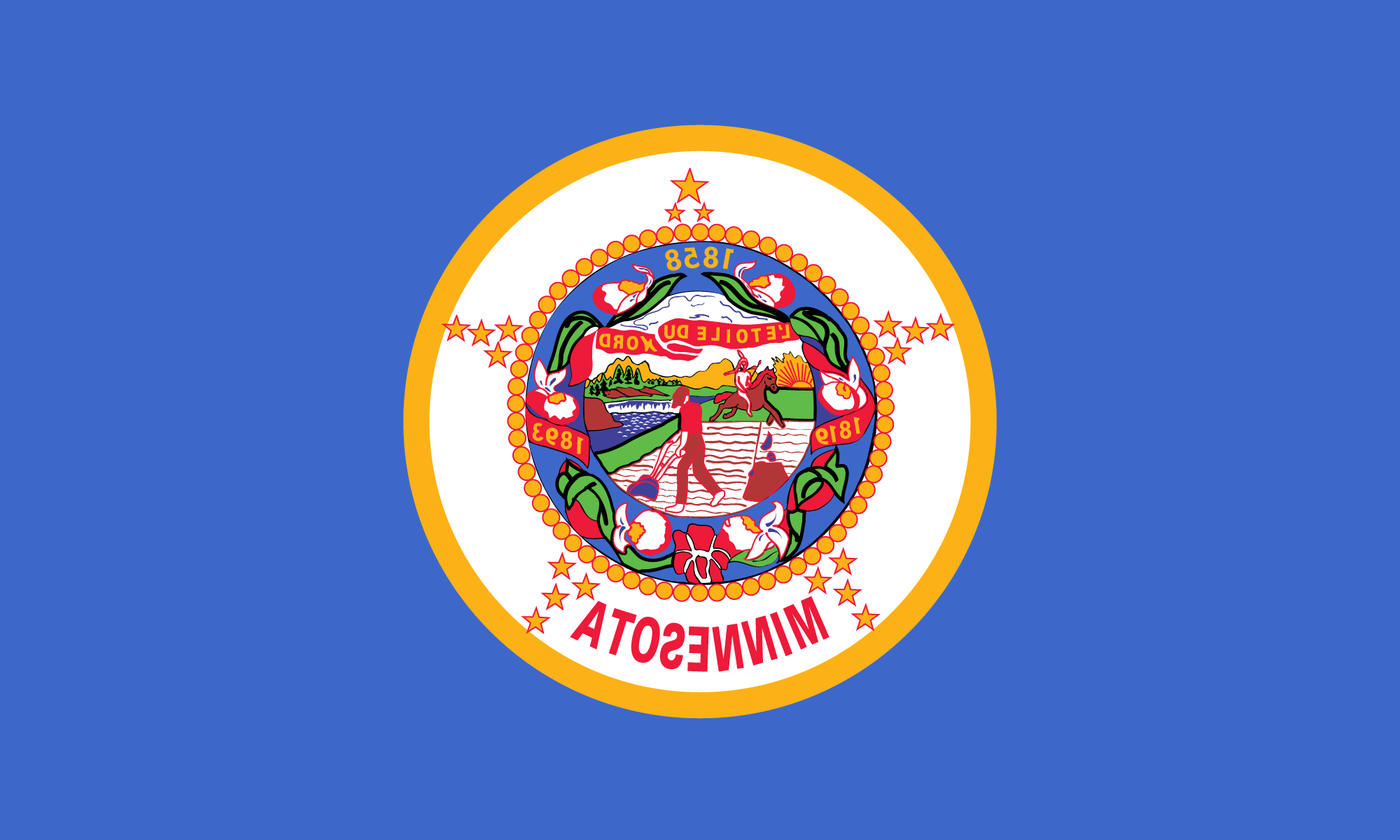
Section two of the bill specified: “The design so adopted shall embody as nearly as may be the following facts: There shall be a white ground with reverse side of blue; the centre of the white ground shall be occupied by a design substantially embodying the form of the seal employed as the state seal of Minnesota at the time of its admission into the Union and described on page 313 of the Legislative Manual of 1891. The said design of the state seal shall be surrounded by appropriate representations of the moccasin flower indigenous to Minnesota. Surrounding said central design and appropriately arranged upon the said white ground shall be nineteen stars emblematic of the fact that Minnesota was the nineteenth state admitted into the Union after its formation by the original thirteen states. There shall also appear at the bottom of the flag in the white ground . . . plainly visible the word Minnesota.””
Both the Senate and House journals of 1893 confirm that the bill did not go through a committee process but was adopted immediately upon introduction in both houses on March 30. That evening’s St. Paul Dispatch commented, “The bill describes the flag which has already been decided upon. It was passed by a vote of 49 to 0. In the name of the delegation of ladies present . . . Senator Donnelly returned thanks to the senate for the courtesy extended.” Governor Nelson signed the bill into law on April 15. Thereafter, the legislation specified, “the said design shall be the only authorized design of a flag for the state of Minnesota.”‘
Thus, the new state flag, proudly displayed at the World’s Columbian Exposition, was probably the conventional Civil War regimental pattern, enhanced in two ways. First of all, the obverse face was white— probably so that the seal and floral wreath would stand out more clearly. A light-blue reverse replaced the usual “Union blue” field. Secondly, several distinctive symbols were added, while other elements in the regimental pattern were slightly adjusted. A wreath composed of the state flower ringed the seal, and the traditional scroll, which originally identified the regiment, became a ribbon woven through the wreath. Adorning this ribbon, which bore the motto E Etoile du Nord (also found on the regimental flags), were three dates: 1858 (statehood), 1819 (the founding of Fort Snelling, the first federal presence in the area), and 1893 (the year of the fair and adoption of the flag). The state’s name was embroidered on the white field. Finally, the nineteen stars arranged around the seal formed a great star—a pattern common among American flags of an earlier era.” The topmost star, the largest of all, represented Minnesota as the North Star State.
It is quite likely that those who designed and selected the first state flag sought to imitate Minnesota’s Civil War regimental colors. The militia in nineteenth-century Minnesota, as in any fledgling body politic, was an acclaimed representative of the state ethos. The Minnesotans who had fought and died for the Union under regimental flags had hallowed the designs with their blood. Indeed, such colors constituted the state’s sole heritage of flags. Where else could the flag committee or would-be designers seek local models to guide their work?
The question can be considered further in the context of other states choosing flag designs. At least fourteen eventually based their flags on regimental precedents. Connecticut’s 1897 state flag followed the blue militia colors dating from the Civil War, bearing the state seal. Delaware’s did much the same in 1913. In Idaho, the adjutant general ignored a design set by law in 1907 and established a state flag conforming to the colors carried by state military forces. Indiana in 1917 adopted a flag standardized according to the conventions of its militia. Militia flags provided the basis for an 1880 flag of the Kentucky State Guard, which in turn was the basis for the state flag in I9I8. Maine’s militia colors became official as the state flag in 1909; Michigan’s early militia colors were standardized in 1865 and provided the model for the state flag in 1911; and the standard of the First Montana Infantry in 1898 was the basis of the 1905 state flag. In New Hampshire, a heritage of regimental colors from as early as 1792 governed the design of the state flag adopted in 1909; and New York’s Revolutionary War colors inspired the design of its state flags in 1858, 1896, and 1901. North Dakota’s militia flag, based on the U.S. Infantry regimental color, became the state flag in 1911. ‘Vermont’s flag of 1923 and Oregon’s of 1925 were both based on militia colors. And, lastly, Wisconsin’s state and militia flags were adopted in tandem in 1863, with only the regimental name on the obverse to distinguish them.'” Although most of these state flags were officially chosen after Minnesota’s, the trend of following military patterns seems clear.
In summary, the physical resemblance between the seal-based regimental colors and the original Minnesota state flag is compelling and more than coincidental. The designs hallowed by the Civil War continued to wield influence—both on regimental flag design and the state ethos—after the adoption of an official state flag in 1893. Changes and embellishments such as additional symbols and a white background better suited the latter for exhibition at the 1893 World’s Columbian Exposition.
There is an interesting postscript to this theory of the origins of the state flag. In 1955 the state legislature established a special committee to resolve several functional problems inherent in the flag’s design—in time for the Minnesota statehood centennial in 1958. Being of two layers of material (white on the front and blue on the reverse), the flag was costly to produce. The committee found, “Manufacturers are able to make flags of the other states, size 3 x 5’ of good quality, at about $7.00 each; the Minnesota Flag costs almost five times that amount if made according to the original bill.” In addition, its bulk made it too vulnerable for display in heavy winds. Accordingly, the panel recommended that the flag be of a single thickness, deep blue on both sides, with the seal and stars appearing on a circular white ground. The legislature adopted these recommendations on March 18, 1957.’^

In the end—though the outcome was unintentional—the 1957 state flag with its new field of Union blue resembled even more closely its predecessors: the blue regimental colors of the Civil War.
Reprinted with the author’s permission.
