Star Tribune | Minnesota Should Have a Flag Worth Waving

From a distance of 100 yards how many Minnesotans can distinguish their state flag from, say, Nebraska’s?  From 100 feet?  Anyone want to try for 10 feet?

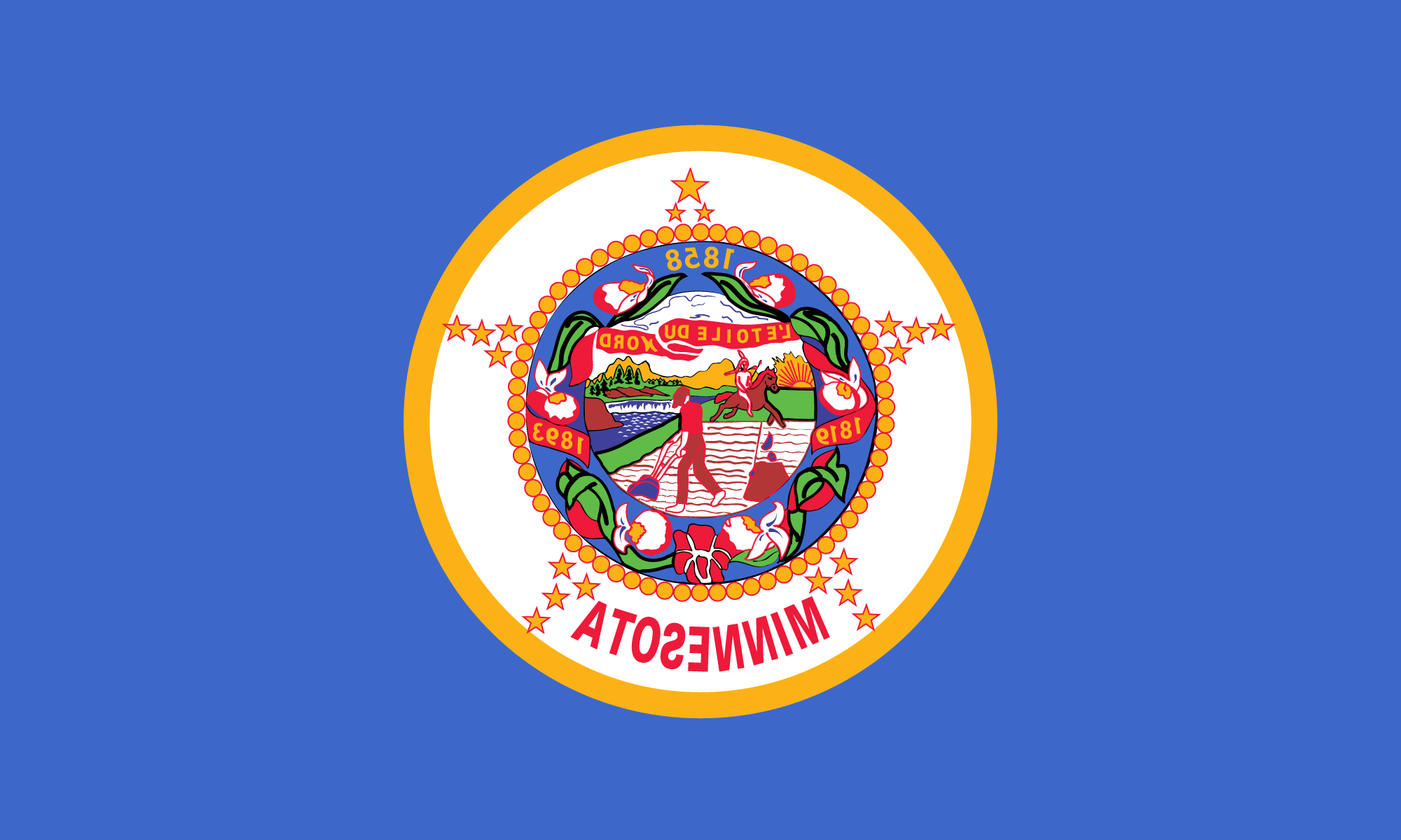
It’s not that Minnesota has the most prosaic flag of all 50 states.  It’s that it shares the distinction with more than a dozen others, each content mainly to sew a copy of its state seal in the middle of a blue sheet and then run the thing up a flagpole to see if anyone salutes, or even notices.

Blue Seals on a Bed-sheet
Can you tell which is Minnesota’s?

That’s a shame.  The official Minnesota flag needn’t compete in splendor with Old Glory.  But when displayed with those of other states — as at the recent Inaugural Day Parade or with the Constitution and the Declaration of Independence in the rotunda of Washington’s National Archives building, it ought to stand out enough to catch the eye, and carry enough symbolism to clutch at a loyal Minnesotan’s heart.

Instead, the visitor is more likely to see and admire the dazzling hues of Maryland’s quartered arms, California’s bear flag, Georgia’s Confederate battle flag, Texas’ proud lone star or Iowa’s eagle-emblazoned tricolor.  Only the determined eye will pick out Minnesota’s flag from among all the other drab, dark-blue look-alikes.

Minnesota used to be somewhat more imaginative.  Until 1957, the flag was blue on one side, white on the other.  But flags of such design were expensive.  So for the last 32 years, the Minnesota flag has been anonymously blue on both sides.

It’s time for a change.  With the approach of the original state flag’s 1993 centennial, a legislative committee has agreed to seek a new design — something more distinctive and recognizable.  One committee member dismissed the proposal as a waste of time.  But that’s the kind of Philistine thinking that gave Minnesota its present banner.  The redesign of the state flag is a good idea that should be treated seriously by legislators, citizens, and flag designers.  Minnesotans deserve a state flag they can wave with pride.

Minneapolis Star | Is Bad Art Good History?

By Austin C. Wehrwein of the Editorial/Opinion Staff

The Minnesota Board of Human Rights is on the warpath against the Great Seal of the State of Minnesota, re-opening thereby a 119-year-old legal dispute.

1858 Minnesota State Seal
1858 Minnesota State Seal (courtesy Office of the Minnesota Secretary of State)

What worries the board about the seal, which is a little like a state trademark, is that it “depicts warfare” between the early white settlers and the red men, and “places the Indian in a derogatory light.”  Human Rights Commissioner Frank Kent, a black man, will ask the legislature to think about authorizing a new seal.

As civil rights issues go, this is rather esoteric.  The seal we have is, without doubt, a horrible example of 19th century government art, but the board had no need to defer to the seal’s “historic significance.”  In 1849 its almost identical predecessor was ridiculed as depicting “a scared white man and an astonished Indian” and “a man plowing one way and looking another.”

Gov. Sibley selected the seal’s motto, “L’etoile du Nord” (North Star).  William Watts Folwell’s “History of Minnesota” says one newspaper “poured out vials of sarcasm upon ‘Mister’ Sibley for selecting a motto from Canadian French patois, the only French known to him, and one conveying no appropriate sentiment.”

In 1860, the Minnesota attorney general said the seal had been sanctioned by usage but implied that Sibley had adopted the design without authority.  In 1861, the legislature, to cure any illegality, passed a law that said, for sure, the great seal was the great seal.

The seal, of which the secretary of state is the “custodian,” is supposed to appear on all “official” documents, including the governor’s stationery.  This is a relic of the time when seals were used to authenticate documents, a practice akin to certifying checks.  In the old common law, a seal had to be a blob of wax on the document on which an impression of a design was made.

The battle of the Minnesota seal began with territorial Gov. Ramsey who cooked up his own, a sunburst with the motto, “Liberty, Law, Religion, and Education.”  Then he asked in 1849 for a law to authorize an official seal, apparently suggesting a design that showed an Indian family welcoming a white man with a peace pipe to symbolize inter-racial friendship, precisely the sentiment the Rights Board would prefer.

However, the legislature rejected the particular design, while authorizing a seal to be selected by Sibley, then a delegate to Congress, and Gov. Ramsey.  The design we have today took its first form from sketches by Col. John James Abert that were redrawn by Capt. Seth Eastman.

That seal depicted a farmer, hand on plow, his musket leaning on a stump.  He is watching an Indian, armed with a lance, riding bareback into the sunset, with St. Anthony Falls in the background.  Sibley is credited with providing the motto, Latin for “I Wish to See What Lies Beyond.”   Whatever it was supposed to mean, one Latin word was misspelled by the engraver.

Their version we have today is virtually the same, except that […] the motto is “The North Star.”  It was adopted by the new State of Minnesota in 1858.  Or rather by Sibley, who was by then governor […]

In the absence of artistic directions from the legislature, Gov. Sibley played with the territorial Seal.  The newspaper that objected to his North Star motto also said nastily that he should have designed a new seal […]

But objection to the design died until the 1968 Human Rights Board revived it.

The present Custodian of the Great Seal, Secretary of State Joseph Donovan, said he wanted to “analyze and digest” the new seal proposal.  Said he of the frightened farmer and fleeing red man, “I don’t know if you can eradicate and erase history to bring it up to date to conform to issues of the time.”